
CASE STUDY: PACK CREEK BEAR TOURS WORDPRESS WEBSITE UPDATE
ASSESSMENT
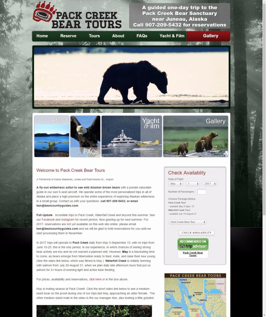
The existing website was a bit dated.
Pack Creek Bear Tours is a successful tour company in Southeastern Alaska. They were already well-known internationally for their top-notch service and world-class experiences, but they felt that their website was not doing their brand justice.
Like a lot of businesses, they had a really old WordPress website that was built the way websites were built a long time ago:
- Custom template with hard-coded page content
- Photoshop-designed layout
- Hard-coded menu
- Not mobile-responsive
Because of the custom template, they couldn’t update their site’s code to the latest version, so it was a sitting duck for well-known, published security threats. And because the template used non-standard structure, they couldn’t simply update with a new one without breaking everything. On top of everything else, they couldn’t even update the text content and their tour descriptions without knowing how to code PHP.
This isn’t an uncommon problem. Websites used to be designed in Photoshop as a rectangular image, then “sliced” up in Photoshop so that each of the smaller parts of the overall image could be assigned actions like a hyperlink to another page on the site. Most navigation (menu) systems used to be designed this way. Not any more. The beauty of WordPress is that it separates the content of your website (the text and images) from the way it’s laid out in the browser — this makes changing the look and feel a snap.
We began by making a duplicate copy of the website on one of our staging servers; we never experiment on live, publicly viewable websites. We then extracted all of the content from the old hard-coded templates and placed it into organized pages and posts. Once this was done, we were able to import the content into a fresh, up-to-date, and secure version of WordPress, which enabled us to show the client what the content would look like with different layout options, color schemes, and typography styles.
RESULT
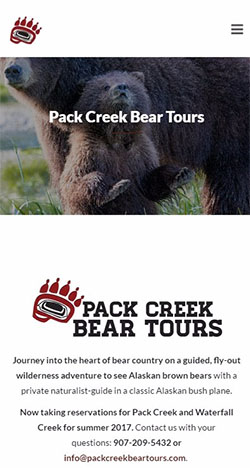
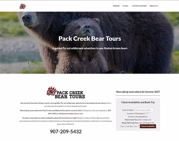
Their old website was very dark, and they knew they wanted “something lighter, more current, and easy to use”. We showed them a nice open design with huge, browser-filling images and they loved it. After some experimentation with color and typography, we settled on a style that the client loves. We moved their hard-coded Reservation interface into a custom WordPress plugin so it can be reused on any page (without even knowing how to write code!), and made it configurable so that changes introduced by their downstream reservation system vendor can be easily accommodated.
We also pruned their navigation down to the bare minimum to make it easy for users — both mobile and desktop — to quickly get to the parts of the site they’re interested in.
We also made sure that the content scales properly for all sizes of screens, and the client has found that most people are now making reservations on their phones.
The result is a clean, fast, and secure website that is a breeze to update with new content, and users that are impressed by the company’s professionalism.
Check out the short video walkthrough below, or click here to try out the site. Does your website need rescue? Click here to contact us for a complimentary needs assessment.

